
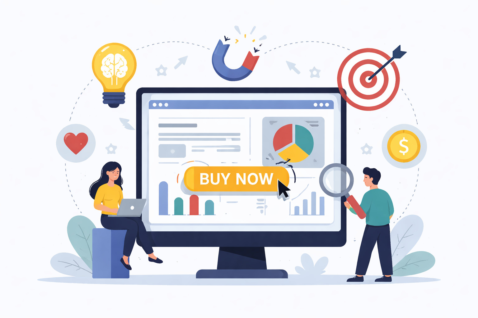
A high converting website is not just well designed. It is strategically structured around human behaviour.
In 2026, the most effective websites are built using psychological principles that guide attention, reduce friction, and build trust. They are designed to make decision making easier, not harder.
If your website is getting traffic but not generating enquiries, the issue is often psychological rather than technical.
Here is how modern websites use psychology to increase conversions.
1. First Impressions Happen in Seconds
Users form an opinion about your website almost instantly.
Within the first few seconds, they subconsciously ask:
- Is this relevant to me
- Does this look trustworthy
- Is this professional
- Am I in the right place
High converting websites answer those questions immediately through:
- A clear headline
- Professional visual design
- Simple navigation
- A strong value proposition
Clarity reduces cognitive effort. When users do not have to think too hard, they are more likely to stay.
2. Visual Hierarchy Directs Attention
People do not read websites word for word. They scan.
Visual hierarchy is the deliberate arrangement of elements to guide the eye in a specific order. This is achieved through:
- Larger headings
- Strategic spacing
- Contrast in colours
- Clear section separation
- Button prominence
In 2026, effective websites use hierarchy to naturally guide visitors from headline to supporting message to call to action.
When attention is directed properly, conversions increase.
3. The Power of Social Proof
Humans are influenced by the behaviour and opinions of others.
This is known as social proof.
High converting websites integrate:
- Testimonials
- Case studies
- Reviews
- Client logos
- Measurable results
Instead of placing all proof in one section, modern websites position it directly after key claims.
For example, if you state that you generate consistent results, follow it immediately with evidence. This reinforces credibility at the exact moment a user is evaluating your claim.
4. Reducing Decision Fatigue
Too many choices create hesitation.
In 2026, high performing websites simplify decision making by:
- Limiting navigation options
- Focusing on one primary call to action per page
- Using clear, direct language
- Removing unnecessary distractions
When users are overwhelmed, they delay decisions or leave altogether. When the path forward is obvious, conversions increase.
5. Clear and Benefit Driven Messaging
Visitors care more about outcomes than features.
Instead of saying what you do, strong websites explain what results someone can expect.
For example:
- Not just Website Design
- But Websites That Generate More Enquiries
This subtle shift taps into motivation. People act when they see a clear benefit to themselves.
In 2026, messaging that focuses on transformation consistently outperforms generic descriptions.
6. Trust Signals Reduce Risk
Every conversion involves perceived risk.
Visitors ask themselves:
- Will this company deliver
- Is my information safe
- Am I making the right decision
High converting websites reduce this uncertainty by including:
- Clear contact details
- Professional branding
- Transparent pricing or process explanations
- Security indicators
- Real images instead of generic stock
Trust is not built with one element. It is built through consistency across the entire design.
7. Strategic Use of Colour and Contrast
Colour influences perception and behaviour.
In modern web design:
- High contrast buttons attract attention
- Consistent brand colours build recognition
- Neutral backgrounds improve readability
- Accent colours draw focus to key actions
The goal is not to use bold colours everywhere. It is to guide attention intentionally.
When calls to action stand out clearly from the rest of the page, users are more likely to click.
8. Minimising Friction in Forms
Even small obstacles can prevent conversions.
High converting websites:
- Keep forms short
- Only ask for essential information
- Use clear field labels
- Provide reassurance about privacy
Each additional step increases drop off. Simplifying the process increases completion rates.
In 2026, frictionless user experience is a competitive advantage.
9. Consistency Builds Confidence
Inconsistent design creates doubt.
If fonts, colours, messaging, and imagery feel disconnected, users subconsciously question professionalism.
High converting websites maintain:
- Consistent tone of voice
- Cohesive branding
- Uniform spacing and layout
- Predictable navigation
Consistency signals stability and reliability.
Bringing It All Together
The psychology behind high converting websites in 2026 is built on three core principles:
- Clarity reduces confusion
- Trust reduces hesitation
- Simplicity increases action
When a website aligns with how people naturally think and behave, conversion rates improve without needing more traffic.
Final Thoughts
Technology continues to evolve, but human psychology remains consistent.
The businesses seeing strong results online are not just investing in design. They are investing in understanding behaviour.
If your website is not converting as it should, the solution may not be more ads or more traffic. It may be refining the psychological structure behind your design.
When strategy meets psychology, websites stop being passive brochures and become active growth tools.